Stuff that keeps me awake at night: my phone, my batting average in 2004, and worrying about accessibility. What if I’ve built a component that not everyone can use? We now all know that accessibility isn’t just a nice to have.
I wanted to go over my current approach for accessible focus indicators, and the journey I took to get there.
Leaving it up to the browser
Do we even need to bother, or should we just leave the browsers to it?
So the official line is that if you leave the browsers to it and don’t change the default focus indicators in any way, then you are being compliant.
Where the focus style of the user-agent is not adjusted on interactive controls (such as links, form fields or buttons), the default focus style is sufficient.
The reality is that some browsers just don’t to do a good enough job for this to be relied upon. Take Safari for example. This is their focus indicator for text inputs, which is not even close to the specified 3:1 non text contrast guideline.
Other browsers do better, but they all have their own versions, with their own quirks, and it’s just not consistent. So you can never be sure that the browser defaults will compliment your design or indeed be accessible for your users.
Cutting our own
So, if we don’t trust the browsers, what options do we have? Other than committing the biggest accessibility sin this side of using tables for layout - by adding outline: none and going home - we are left with one option: Doing it ourselves!
Whilst a daunting prospect, it does mean that we control our own destiny and can work on getting the focus indicators to compliment our design and not fight against it.
W3C Guidance
Before we look at solutions, what do our friends over at the World Wide Web Consortium say on the matter?
…the visual focus indicator for a component must have sufficient contrast against the adjacent background when the component is focused, except where the appearance of the component is determined by the user agent and not modified by the author.
If the focus indicator is styled by the author, it must meet the 3:1 contrast ratio. This for me is where a lot of confusion seems to be introduced. W3C specify that the contrast should be against the background.
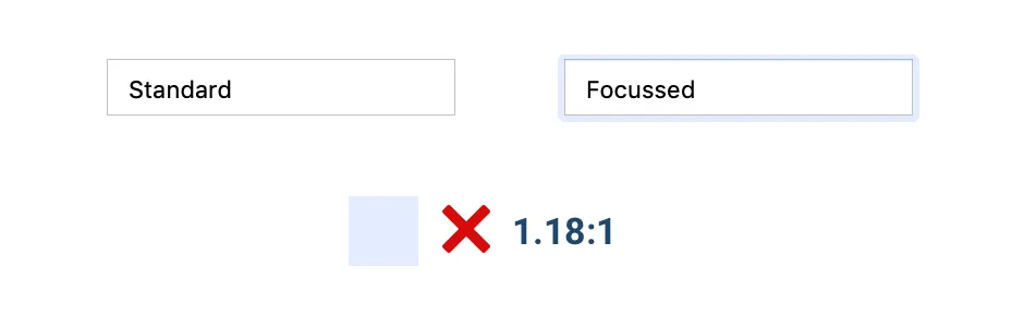
If we take a look at GOV.UK’s implementation (my usual go-to for great examples of accessible components). The yellow focus indicator has great contrast with the border of the text input, but nowhere near 3:1 against the background.
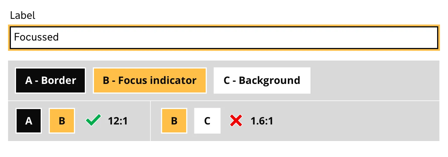
On the examples on W3C’s own page, it’s the other way around. The blue focus indicator is nowhere near a 3:1 contrast ratio with the input’s border. Whereas the ratio against the background is compliant.
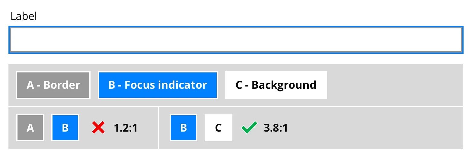
The W3C stance feels clear to me; the focus indicator should be contrast compliant against the background, but not so much with the border itself.
Both solutions feel half hearted. If it’s important for 3:1 contrast ratios to determine different states, then it feels like we’d need some sort of mythical acceptable contrast for the focus indicator against both the input border and the background.
- With the W3C example, it seems to be just relying on the fact that the border, plus the focus indicator, has a bigger footprint.
- With the GOV.UK example, where do you stop if the focus indicator doesn’t have enough contrast with the background? You could edge further towards white and have incredible contrast against the input border, but it’d be essentially invisible!
Outline vs Box-shadow
There are a couple of CSS properties to help us out with custom styling:
- Outline: This property is as it sounds. Adding an outline to an element. It is drawn outside the elements border, isn’t included in the element’s width, and can overlap other elements. The well known caveat with using
outlineis that if your element hasborder-radiusthen the outline will still have squared corners, which is less than ideal. - Box-shadow: The
box-shadowproperty is the cool kid on the block, everyone uses it. It gives you more styling options, and the major benefit is unlikeoutlineif you have border radius on your elements, thenbox-shadowwill hug the corners! Do be aware though that using this property has accessibility issues with Windows High Contrast mode.
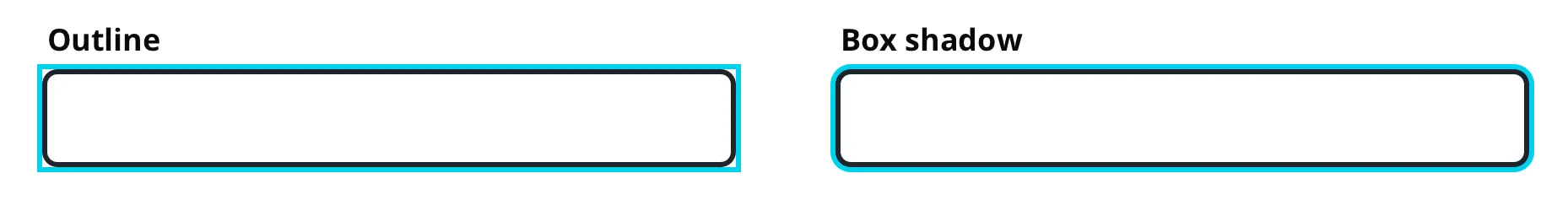
Again, the focus indicator colours above are contract accessible against the border colour, but not against the background colour.
What if we offset the focus indicator?
So onto outline’s secret weapon, the ability to offset the outline. If we add some white space between the borders and the focus indicator, we can then just focus (pun intended) on the contrast ratio against the background.
It’s a double edged sword. You can more easily compliment your styles, because you have more control over using a colour that only needs to be accessible against its background. However, it does mean that you really need squared off elements. I believe that the benefits outweigh the negatives here, but obviously it’s something you need to consider.
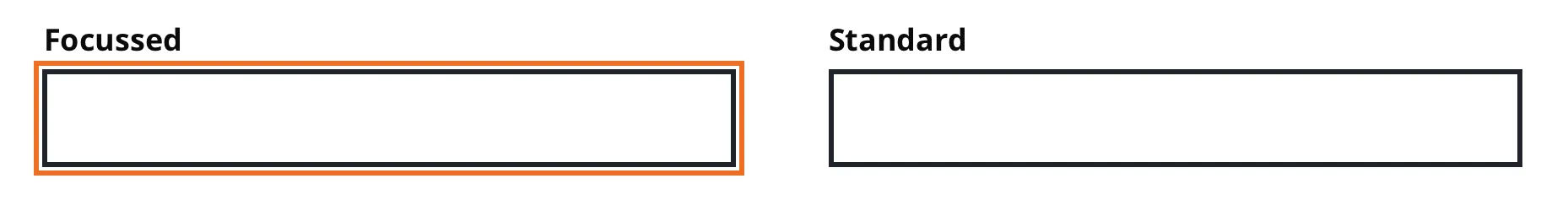
The above is an accessible focus indicator that meets the 3:1 contrast ratio requirements, whilst also not suffering the affliction of merging into the border.
It’s worth noting that outline-offset is not supported in IE11. Internet Explorer, every web developer’s best friend. There are workarounds.
Summary
I’ve never been satisfied by most approaches to focus indicators, especially given the W3C guidelines. They either blend into the border, or don’t have enough contrast with the background.
Offsetting the indicator allows us have the best of both worlds, albeit with some considerations around browser support and border radius.