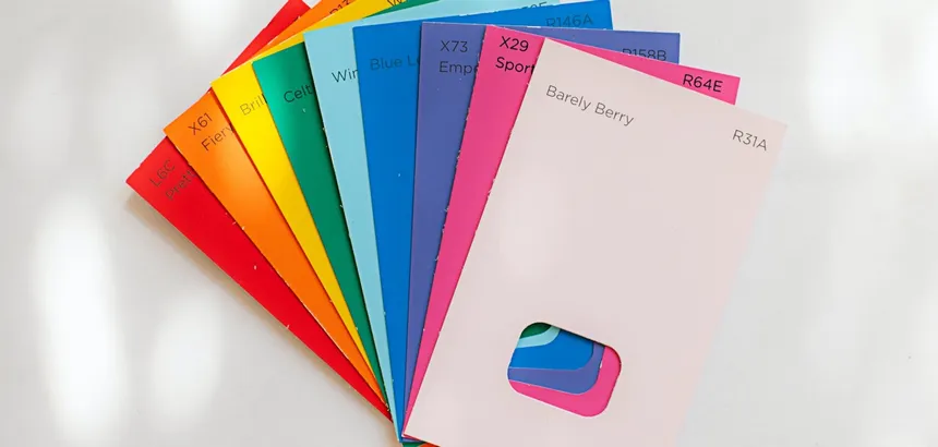
Have you ever got back from IKEA, full of anticipation and excitement at the thought of constructing a cupboard yourself? Only to be left questioning your life choices two hours later, when you realise you’ve put two of the panels on upside down.
This can be a similar experience when application designs are handed over to developers. Often a sizeable amount of guesswork goes into translating design documents into code. Enter design tokens. They’ll do absolutely nothing to help your wonky cupboard doors, but can greatly help designers and developers create consistent user interfaces.
It wasn’t that long ago that services like InVision’s Inspect and Zeplin started to make the design to developer handover a thing that could be taken seriously. These solutions provide a well needed bridge between design and development, doing away with the painful concept of manual redlining. It still often leaves a lot open to interpretation. Design tokens hope to help with this interpretation, and get everyone talking in the same language.
What are design tokens?
At their core, design tokens are tiny bits of styling information that are tech agnostic. They are design decisions, translated into design variables that are made available in different coding languages.
The tokens are things like colours, sizes, spacing — which on their own might be fairly meaningless — but used together and with some guidelines, can enable developers to create applications that are fully consistent with the design system.
The tokens also live in one place, which is where it starts to get really powerful. If the CEO suddenly has a change of heart, and wants to change the brand’s primary colour from blue to purple (that would never happen, right?), the colour can be updated centrally, and every consumer will get the updated token in their application.
Benefits
- Avoids code duplication: As with anything in code, when you can avoid repeating yourself, you should. Duplication is error prone. Not to mention, when you have multiple teams implementing similar but different solutions to the same problems, it becomes even more costly to the business. Having the default text colour defined in one place is the best option, and indeed, the safest option.
- Free updates: As mentioned above, when design decisions are made, and tokens might be tweaked. For the large part, consumers can get those updates for free. If the large font size is increased by 2px, the variable name doesn’t change, and the design system remains in tact, with very little work.
- Common language: The more the tokens are used, the more familiar everyone will be when referencing them. So when a designer suggests changing a button to color-palette-secondary, the developers will know exactly what they mean. Historically, this would have probably ended with the developer asking for the hex value 😬.
- Tech agnostic: What happens when you want to move from SASS to CSS in JS? You’ve abstracted much of the fundamentals and it’s easier to migrate.
- Design/UX ownership: Historically there would be a large onus on a development team to implement a design system into their stack. Using design tokens gives more of that responsibility to the design team.
How to create design tokens
Depending on the tool set you are using, your mileage may vary. For this example, we’ll be looking at Adobe XD and Style Dictionary.
The workflow will look something like this, and we’ll go into slightly more detail below.
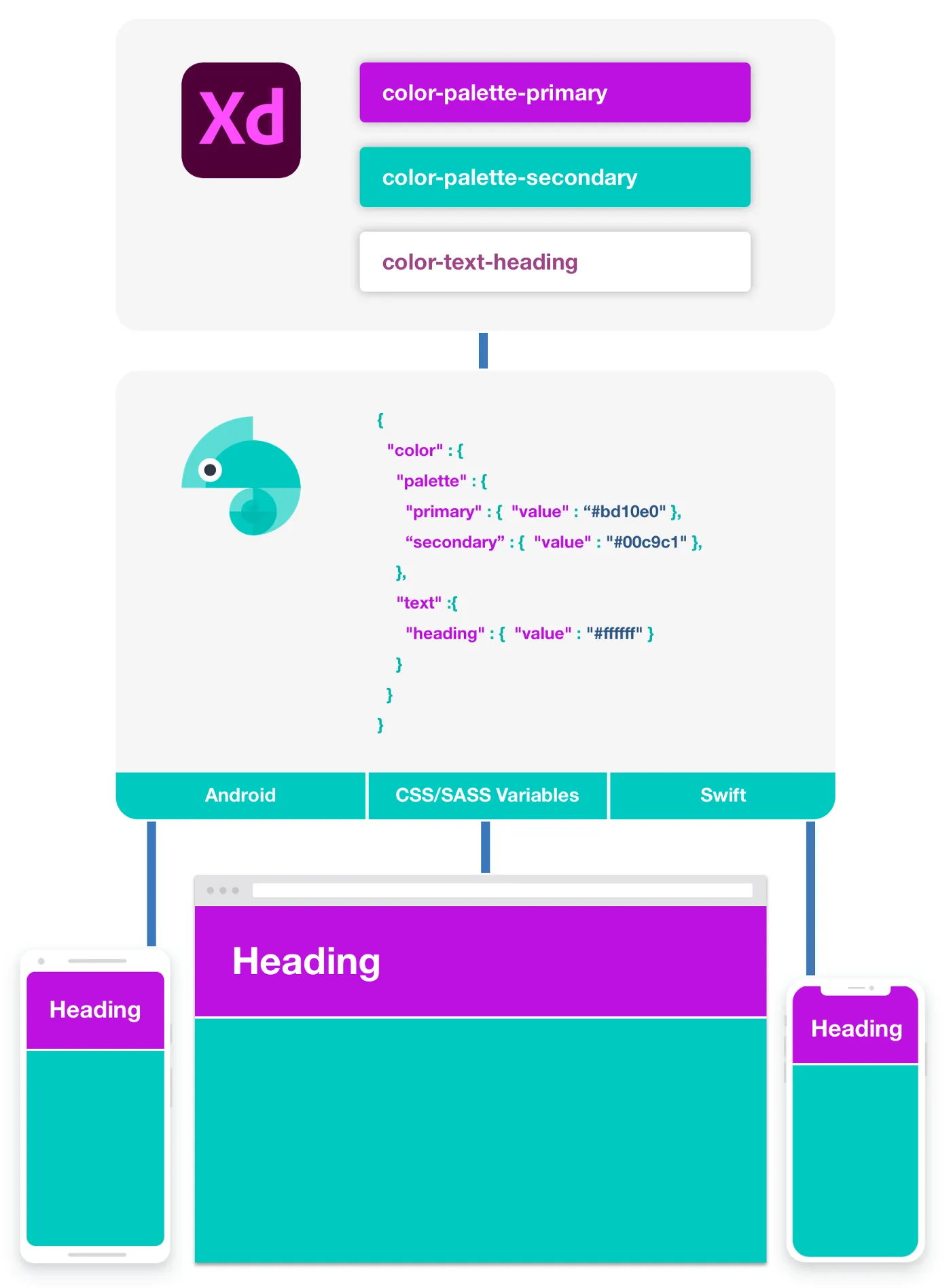
Adobe XD
Behind every token, there is a design decision. Once these decisions start to be made, they can be validated alongside the rest of the design system to make sure everything still looks and feels right. Adobe XD announced this week, that it now supports design tokens (CSS Variables). This means that designers can start to label up certain things like colours with the same names that the developers will be using.
Once the tokens have been validated they can start to be created.
Style Dictionary
One of the core selling points of design tokens, is the fact that they are tech agnostic. This means that the tokens are written in a generic language (JSON in this instance) that allows it to be translated into the right formats for consumers. We want to avoid just coding the tokens straight into SASS.
Style Dictionary allows just this, and it also has a really deep level of configuration to get the tokens doing exactly what you want.
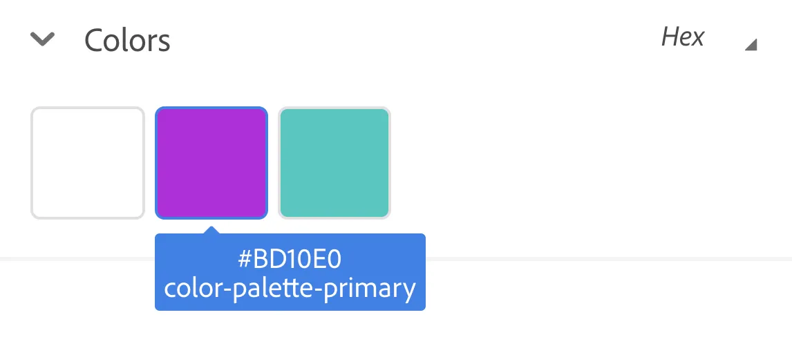
The tokens are authored in the format below:
{
  "color": {
    "palette": {
      "primary": {
        "value": "#bd10e0"
      },
      "secondary": {
        "value": "#00c9c1"
      }
    },
    "text": {
      "heading": {
        "value": "#ffffff"
      }
    }
  }
}
Once built, Style Dictionary will provide the variables in files that can be used by consumers.
Example of the SASS variables that are generated:
$color-palette-primary: #bd10e0;
$color-palette-secondary: #00c9c1;
$color-text-heading: #ffffff;
Example of the Swift variables that are generated:
public enum StyleDictionaryColor {
  public static let palettePrimary = UIColor(red: 0.741, green: 0.063, blue: 0.878, alpha:1)
  public static let paletteSecondary = UIColor(red: 0.000, green: 0.788, blue: 0.757, alpha:1)
  public static let textHeading = UIColor(red: 1.000, green: 1.000, blue: 1.000, alpha:1)
}
These outputs can then be bundled into an NPM package, which will allow you to do meaningful releases with release notes. This means that if a design decision is made to remove a token, then it can be called out in the release notes. It then won’t be a shock to consumers when they need to make changes to their code.
The future
Allowing designers to manage the design tokens, ensures consistency right from the start. It puts the right people in control of what they specialise in. That being said, it’s still not a seamless experience for designers to actually use the tokens in their own workflows.
The concept of design tokens has been around for a few years now, and it’s slowly becoming common place. Hopefully, with increased usage, the features will start to improve with design tools like Sketch, Adobe XD and Figma, and designers will be able to consume their own tokens in a native and fully featured way.