Before we start, I’d like to apologise in advance… I’m based in the UK, so the flipping between colour/color in this article is real!
When asking if something is accessible, common feedback will be around contrast ratios. This article aims to outline what contrast ratios are - in context to accessibility, what the requirements are, and how you can check you are meeting those requirements.
What is WCAG
Get ready for some acronyms! The Web Content Accessibility Guidelines (WCAG) are a set of accessibility guidelines, published by the Web Accessibility Initiative (WAI). The World Wide Web Consortium (W3C) launched the WAI in 1997, with a goal to improve the accessibility of the web to users with disabilities.
The actual WCAG technical documents are created by the Accessibility Guidelines Working Group (AG WG), which are part of the WAI.

A, AA and, AAA
The WCAG requirements come in three levels; A, AA and, AAA. To be clear, these are levels of conformance to accessibility, not battery sizes.
The higher levels encompass lower ones. So to meet a conformity level of AA, you’ll need to have met all the level A and level AA success criteria.
- Level A is the minimum set of conformance.
- Level AA is generally the level that most sites are aiming to meet. It can often be a level that is a legal requirement.
- Level AAA is the strictest level, and can introduce significant design challenges given the nature of the success criteria. It is considered the gold standard level of accessibility.
What is contrast ratio
It’s probably worth giving a brief outline of what contrast ratio actually means.
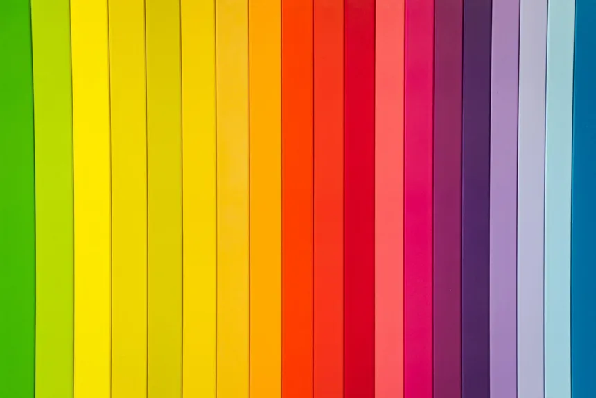
The WCAG contrast measure essentially measures the difference in brightness (luminance) between two colours. It ranges from 1:1 (white on white) to 21:1 (black on white).
Comparing different colours, will provide mixed results. For accessibility in isolation, the higher the left hand number the better.
Contrast criteria
WCAG has three main requirements that are related to contrast. It’s worth noting that incidental elements (which we’ll look at below) and logos have no contrast requirements.
Contrast is also called out in the following requirement, when differentiating links in text by colour alone.
We’ll look at each one individually:
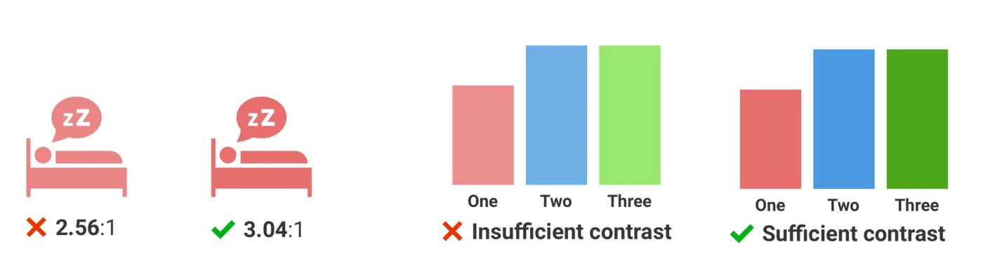
1.4.3 Contrast (Minimum) — Level AA
This is the classic contrast check that most developers hold themselves accountable to.
The main success criterion is as follows:
The visual presentation of text and images of text has a contrast ratio of at least 4.5:1, except for the following:
Large Text: Large-scale text and images of large-scale text have a contrast ratio of at least 3:1;
The large text part is interesting. 14pt and 18pt are equivalent to approximately 18.5px and 24px. So large text is generically defined as 18.5px bold text or larger, or 24px or larger regular weight text. Your fonts may vary!
Examples of colour combinations for 1.4.3 Contrast (Minimum)
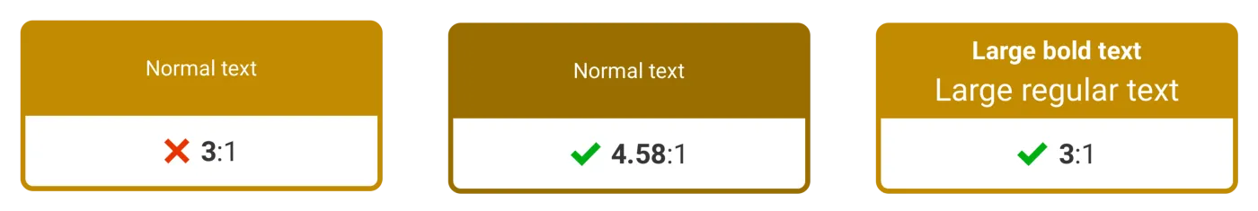
Large text can have a lower contrast ratio, since it is already easier to read. From the image above, you can see a basic example of what that means in reality, a failing ratio for normal text, passes at the larger size.
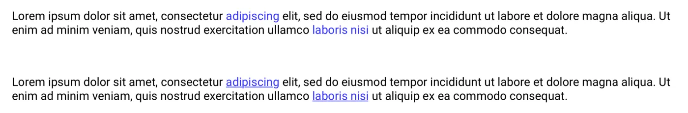
1.4.6 Contrast (Enhanced) — Level AAA
To get the triple A badge of honour, you’ll need to go one step further.
The main success criterion of 1.4.6 is as follows:
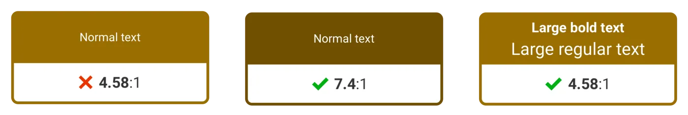
The visual presentation of text and images of text has a contrast ratio of at least 7:1, except for the following:
Large Text: Large-scale text and images of large-scale text have a contrast ratio of at least 4.5:1;
This essentially just means to get to level AAA, the bar is set higher.
Examples of combinations for 1.4.6 Contrast (Enhanced)
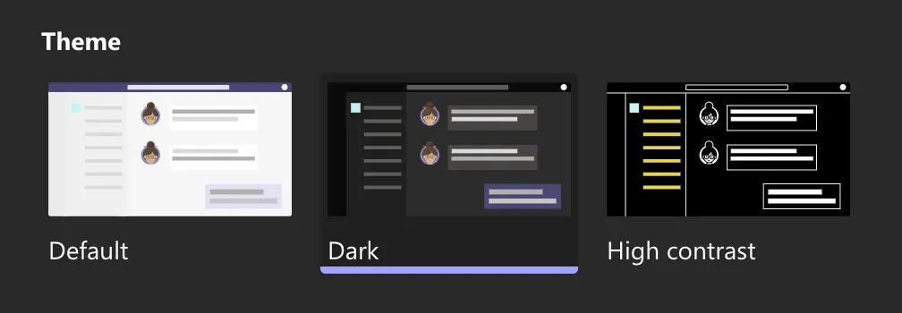
The enhanced contrast requirement can cause headaches for designers, when trying to balance aesthetics with belts and braces accessibility. As scary as this seems, it shouldn’t be totally disregarded. Where possible, level AAA should be targeted. If it feels too much of a compromise, one option is to have a high contrast mode that can be enabled.
Microsoft Teams theme selection
1.4.11 Non-text Contrast — Level AA
Non-text contrast is looking at other parts of the meaningful user interface. Things like icons, graphs, and controls. It looks at the contrast ratio with the component vs its adjacent colours.
The main success criterion of 1.4.6 is as follows:
The visual presentation of the following have a contrast ratio of at least 3:1 against adjacent color(s):
User Interface Components: Visual information required to identify user interface components and states, except for inactive components or where the appearance of the component is determined by the user agent and not modified by the author;
Graphical Objects: Parts of graphics required to understand the content, except when a particular presentation of graphics is essential to the information being conveyed.
The contrast ratio is lower in general for non-text. Set at 3:1.
Examples of colour combinations for 1.4.11 Non-text Contrast
1.4.1 Use of Color — Level A
I think if you ask someone if a design is accessible or not, generally the first thing that will be called out, is to avoid using colour to differentiate visual elements.
Color is not used as the only visual means of conveying information, indicating an action, prompting a response, or distinguishing a visual element. WCAG guidance
Interestingly (probably not interestingly), there is sub guidance around acceptable contrast levels to differentiate links in text if using colour alone. It’s called out as being 3:1, and they provide some good examples of this in action. Sadly, and awkwardly, my own website is falling foul of this.
Meeting this criteria can become a real balancing act, to get the contrast level right between the text and links, whilst also making sure they both have enough contrast with their background. It is still best practice - and recommended - to use underlines when using links in text.
Incidental content
Two of the requirements (1.4.3 and 1.4.6) mention that incidental content is out of scope. Incidental is called out as the following:
Text or images of text that are part of an inactive user interface component, that are pure decoration, that are not visible to anyone, or that are part of a picture that contains significant other visual content, have no contrast requirement.
In my experience this can be open to a lot of differing of opinions. A good example is a disabled submit button.

Users with no visual impairments will be able to see the button is there, and immediately benefit from knowing that they need to do something to enable that button. Users with visual impairments will not.
You can certainly argue that the rest of the UI should be doing the work to highlight to the user with visual impairments that there is work to be done. Bringing the contrast levels up on inactive content will also soon get troublesome. With how you’d do that, while still getting the message across that it’s inactive.
Checking contrast ratio
Thankfully, there are a number of ways you can check contrast, whether it’s manually checking individual colours, whole pages, or in a development pipeline.
Manual contrast ratio checking
There are a number (great number) of websites online that allow you to punch in two numbers and get some WCAG AA/AAA results out.
- https://color.review/: As well as highlighting the passes and fails, shows an example page with content in to get an idea on how well the colours work together.
- https://colourcontrast.cc/: Allows you to try out different fonts, quickly save combinations, and includes Back to the Future quotes. What’s not to like?
- https://webaim.org/resources/linkcontrastchecker/: Useful for when you’re being stubborn, and refuse to underline your links!
Manual page contrast ratio checking
Sometimes the ship has already left the harbour. Or you want to check all the colours in context of their usage in a full page. There are a number of browser plugins and tools that can be used to achieve this. These tools check more than just contrast ratios, so they really do add value when checking pages.
- Lighthouse: Perhaps the most well known check, Google’s own open-source tool can be run in developer tools (right click -> Inspect -> etc). Running the accessibility segment will give you any errors it can detect, and highlight those in the page.
- WAVE: This browser plugin does a similar thing to Lighthouse. It will immediately highlight any contrast ratio errors it discovers (to AA level).
Continuous integration (CI) checks
When developing, it is always a good bet to be constantly checking for violations. Manual checks will only catch so much. Often a change will be made to one file, that impacts a number of files.
At this stage, we really want to be checking the whole application/website before we merge the changes and push it live, this is where CI checks come in. As with the manual page checks above, these tools check for more than just contrast ratios.
- Pa11y CI: Pa11y publishes a number of free and open source tools to check for accessibility. Pa11y CI is great to run against a sitemap and highlight any non conformances. If it finds any contrast issues, it will even suggest a colour to use that will pass the checks.
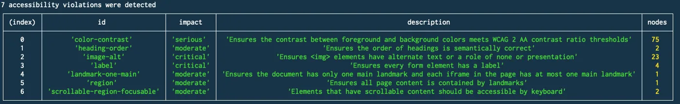
- Axe and Cypress: If you are using Cypress to run end to end tests, it makes sense to add cypress-axe. This allows you run accessibility checks given certain scenarios - like expanding a section on the page - and not just on initial load.
Summary
Given the hard rules for meeting the WCAG contrast ratio requirements, it’s easy to test against, from the initial design phase, right through to the development pipeline.
Although there are few nuances when you get right into the details, contrast ratio is something that is relatively easy to manage and can be at the forefront of your mind throughout the whole design and development cycle.